Habit and Step Challenges
Introduction
Client Commit - Responsive Web
Personify Health's personal challenge experience had accumulated years of design debt. Over time the experience had drifted. Different challenge types, different user roles, and years of incremental additions had left it feeling inconsistent across devices and out of step with where the product was headed.
When one of the company's largest incoming enterprise clients identified challenges as a top priority for their launch, it created the forcing function to fix it properly. I led the end-to-end redesign of the personal challenges experience across web and mobile. What started as a commitment to responsive web became a full redesign. The visual language, the interaction patterns, and the underlying structure all needed to be rebuilt to hold up across every state a member could encounter. The client successfully launched on the redesigned experience.
I was the lead designer on this project, responsible for the end-to-end experience across both challenge types and both platforms. That meant auditing the existing experience, defining the interaction patterns, and working closely with product and engineering to make sure the redesign held together technically as well as visually. I brought work into critique sessions to pressure-test decisions with other designers and stayed closely involved through handoff.
Research
Auditing the Existing Experience
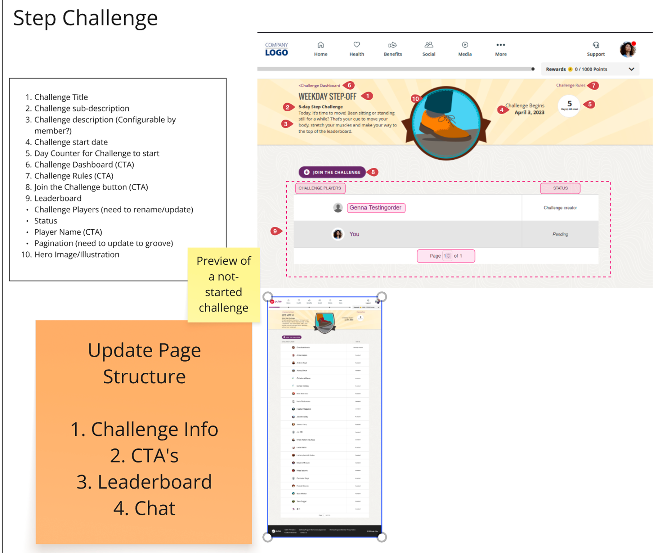
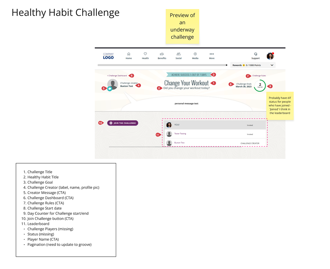
Before designing anything, I audited the existing experience across desktop and mobile to understand what was actually broken. The problems fell into a few clear categories.
• Layouts didn't hold up on mobile, with components collapsing or overflowing in ways that made the experience feel unfinished.
• Navigation Patterns were inconsistent between the two challenge types, so a member who created a step challenge and then joined a habit challenge encountered what felt like two different products.
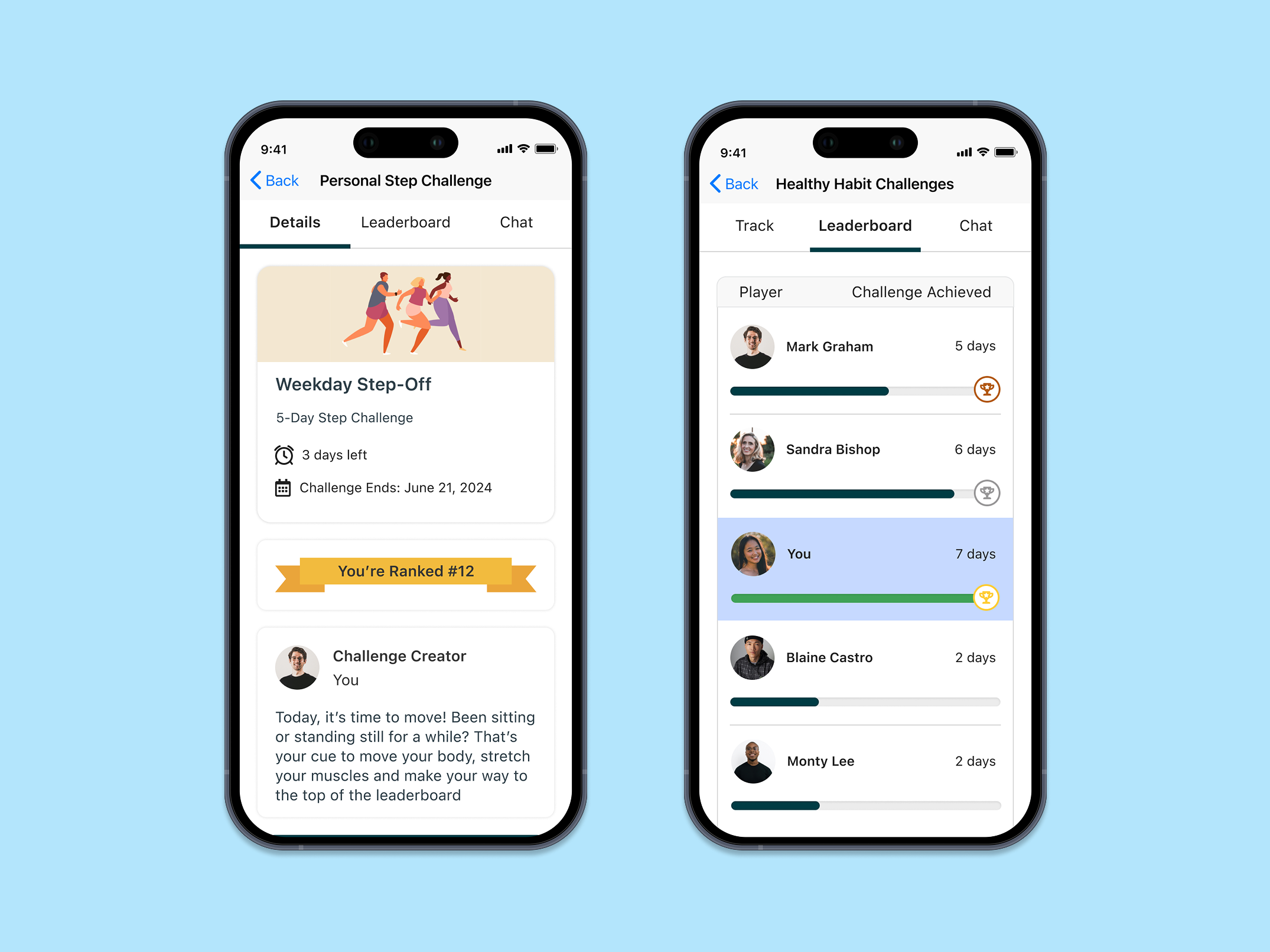
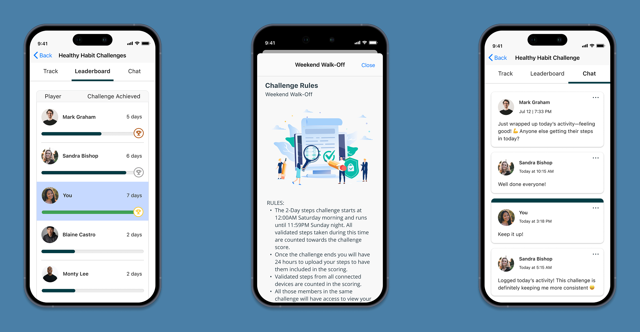
• The Leaderboard was one of the most engagement-driving surfaces in the experience, and a product manager kept pressing on how to display metrics fairly across different challenge formats, since a step count and a habit streak aren't the same kind of number.
• The Creator Role had no clear visual language distinguishing it from a participant, which created confusion about what actions were available and to whom.
I documented these findings and brought them into critique sessions with other designers before aligning with product on which problems were highest priority to solve.
Core insight
The challenge experience was not designed responsively, leading to layout inconsistencies between desktop and mobile.
Core insight
Navigation patterns were unclear, making it difficult for members to understand challenge progress and actions.
Core insight
Some features were difficult to discover, reducing engagement.
Core insight
Interface components were inconsistent across screens.
define
The Real Problem
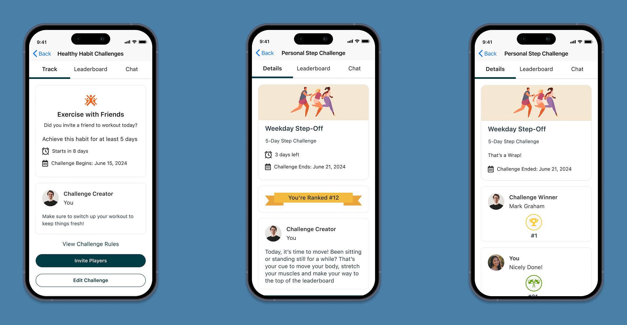
As the audit came together it became clear we had found a bigger problem, one that addressing responsiveness alone would not solve. The experience had been built incrementally over time, with features and challenge types added without a unifying design framework underneath them. By the time we audited it, two challenge types shared the same surface but spoke different visual languages. Two user roles occupied the same screens with no clear hierarchy between them. Five distinct lifecycle states existed across the challenge journey with inconsistent patterns connecting them. Fixing the layout for that launch meant fixing all of it, because you can't make a fragmented experience responsive without first making it coherent.
UX Strategy
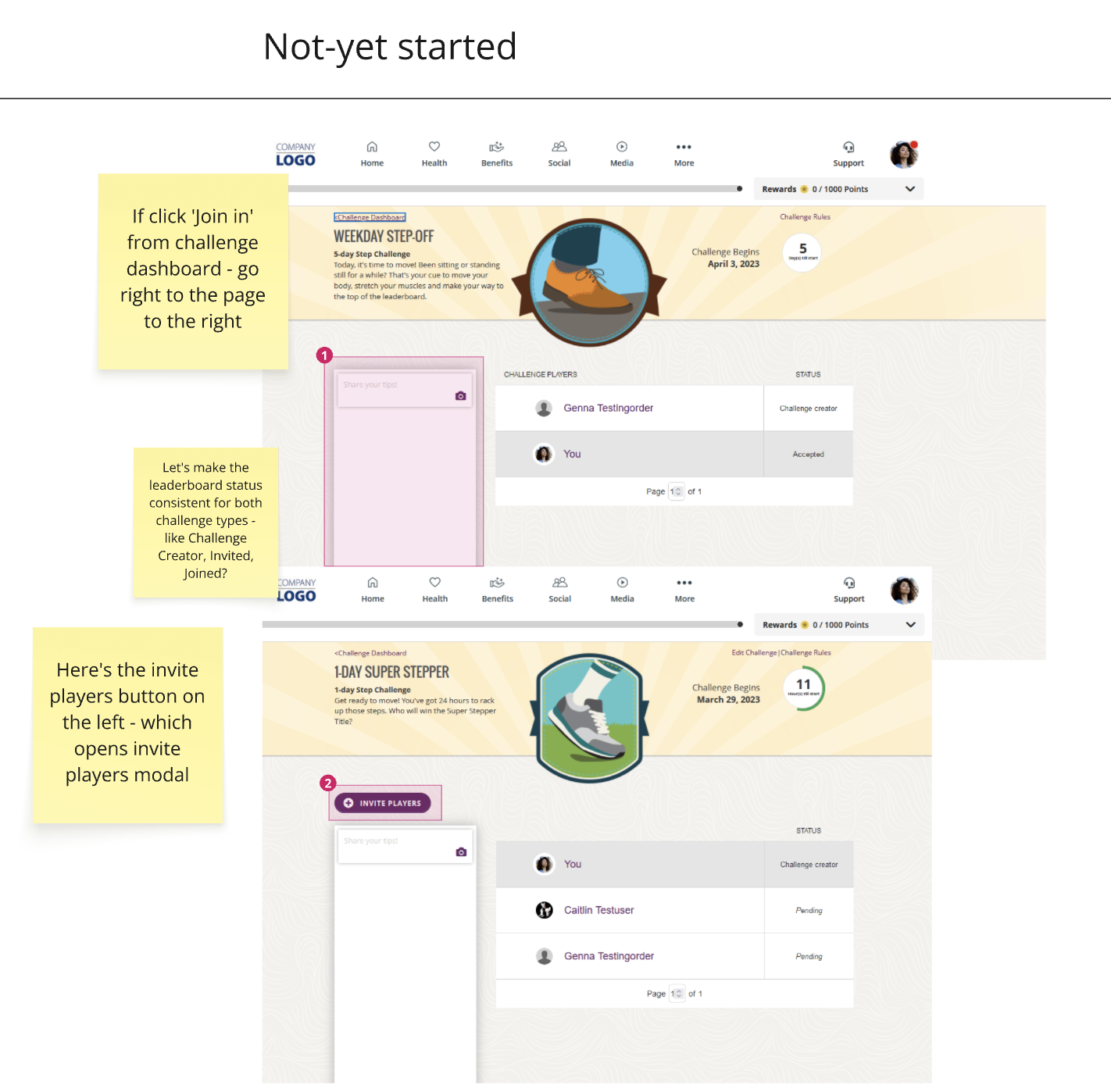
Unifying two challenge types under one framework
Step challenges and healthy habit challenges had grown into parallel experiences that shared a surface but not a system. Rather than treating them as separate design problems, I established a shared framework: consistent page structure, shared navigation patterns, and a unified set of lifecycle states that worked the same way regardless of challenge type. The differences between them, primarily in how progress is tracked and displayed, were handled at the component level rather than the experience level. A member moving between challenge types should feel like they're in the same product.
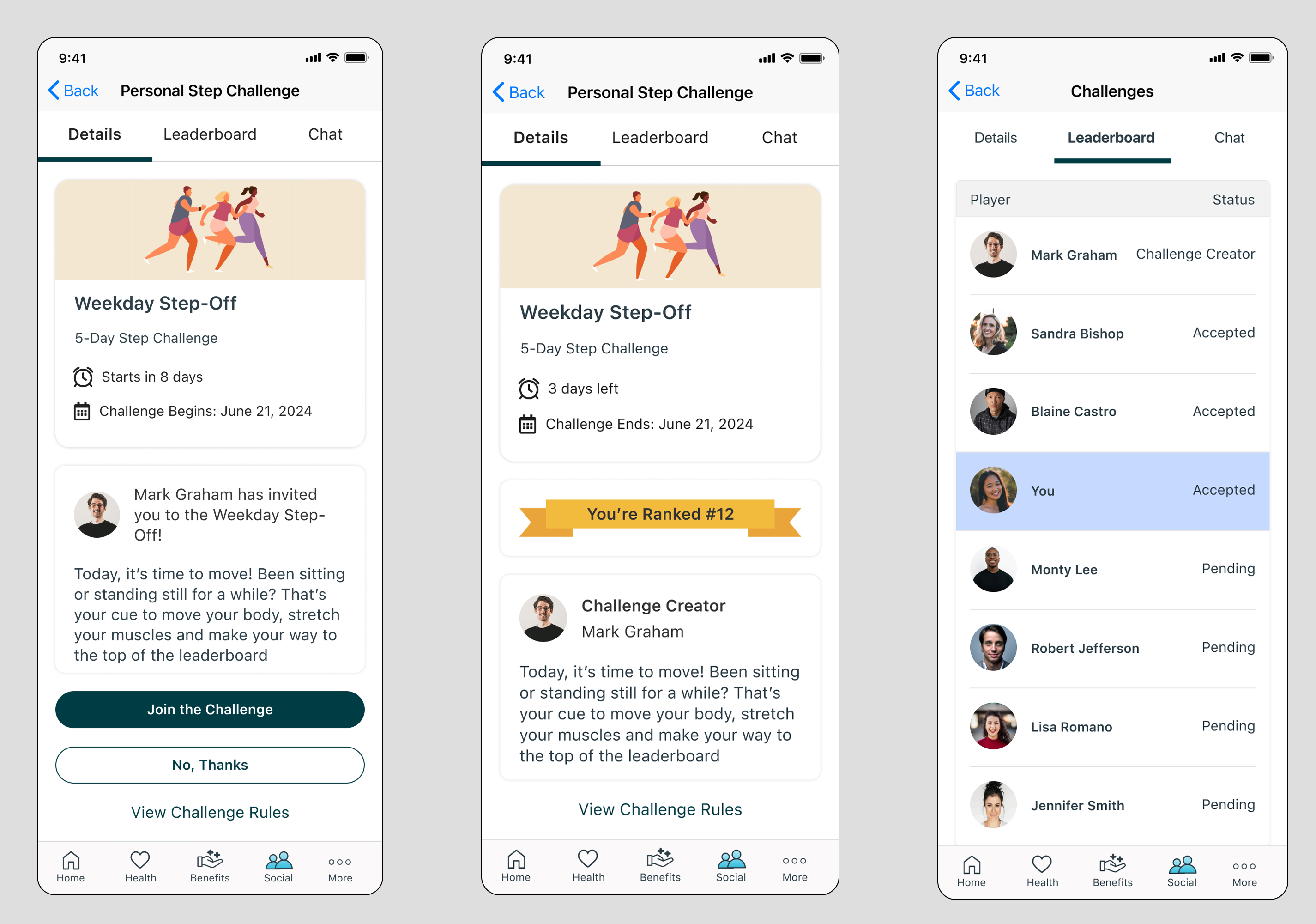
Designing for two roles without two experiences
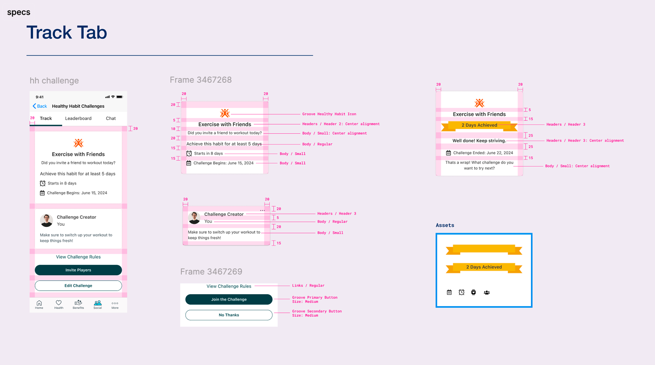
Every personal challenge has a creator and participants, and those two roles have meaningfully different permissions and responsibilities. In critique, a design partner flagged the real risk: with both roles sharing the same screens, it wasn't visually clear who could do what, and that ambiguity would confuse members about which actions were theirs to take. The creator can edit the challenge, invite players, and manage participation. A participant can only engage with what's been set up for them. Rather than building separate flows, I designed a single experience where role-specific actions surfaced contextually. Creators saw additional controls inline. Participants saw a cleaner, more focused view. The underlying structure was identical, which kept the experience consistent and the engineering footprint manageable.
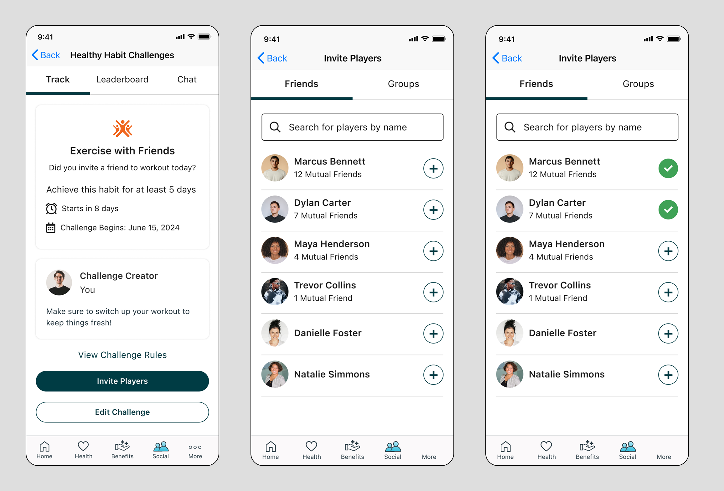
Making progress visible in the moment
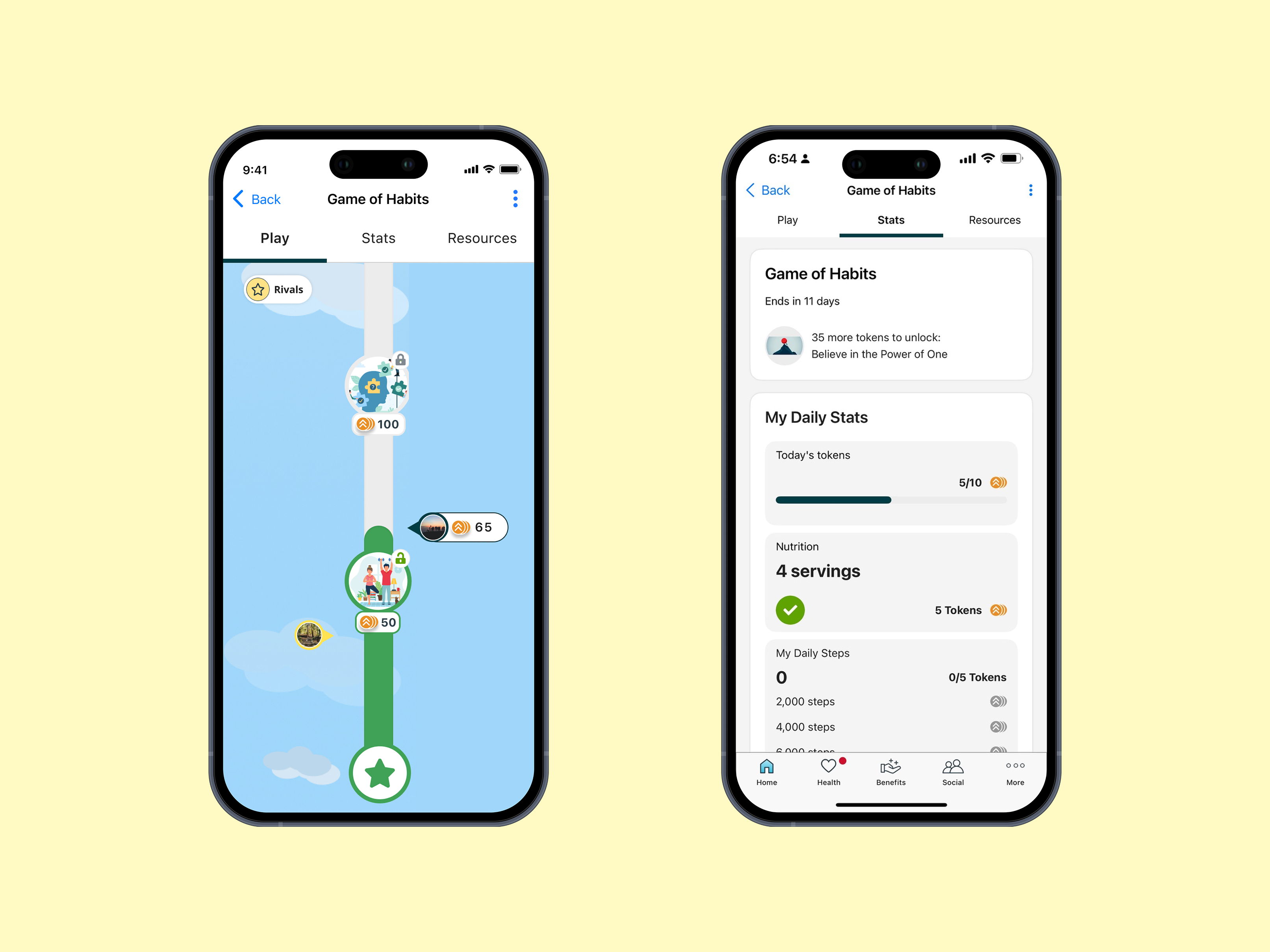
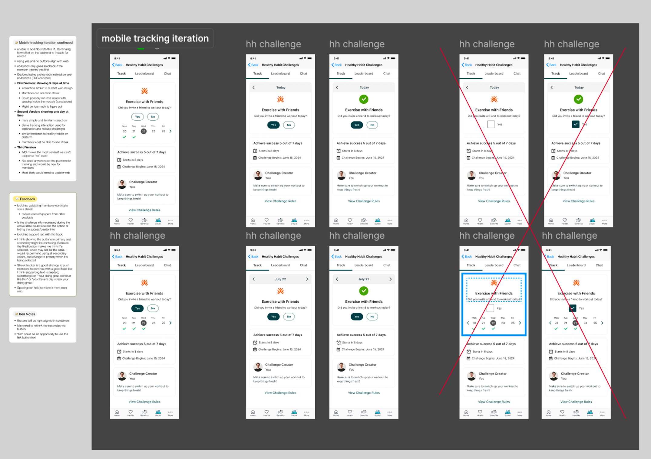
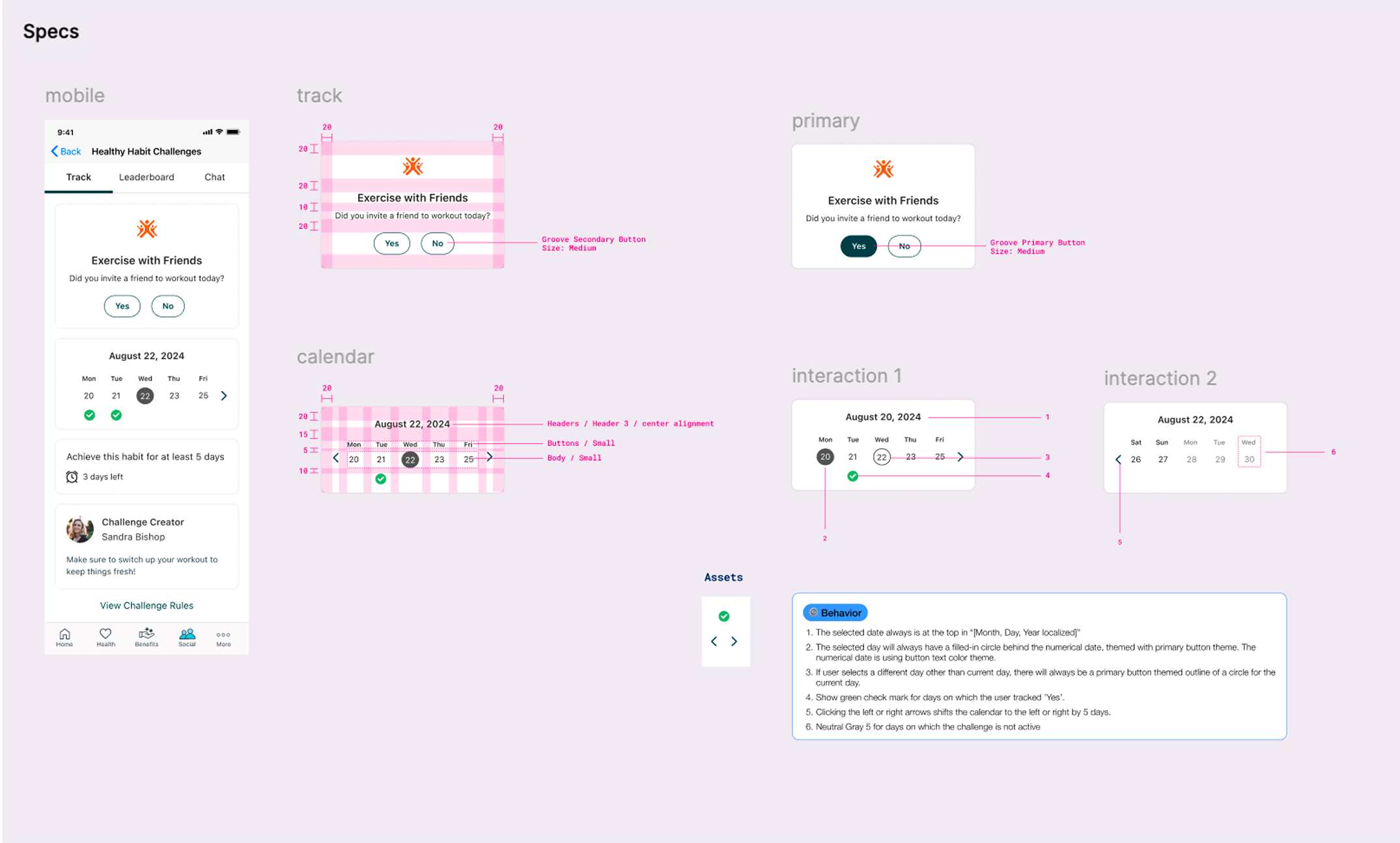
The healthy habit challenge introduced a tracking mechanic that didn't exist in step challenges: members needed to log a yes or no response each day and understand how their streak was building over time. The calendar component we designed solved three things at once. It gave members a clear view of their history so they could see patterns forming across the challenge duration. It made navigating to previous days straightforward, which mattered because members don't always track in real time. And it delivered a confetti animation the moment a member logged their activity, connecting the daily micro-action to the larger goal they were working toward. Progress that's visible feels meaningful. Progress that's buried in a stats page doesn't.
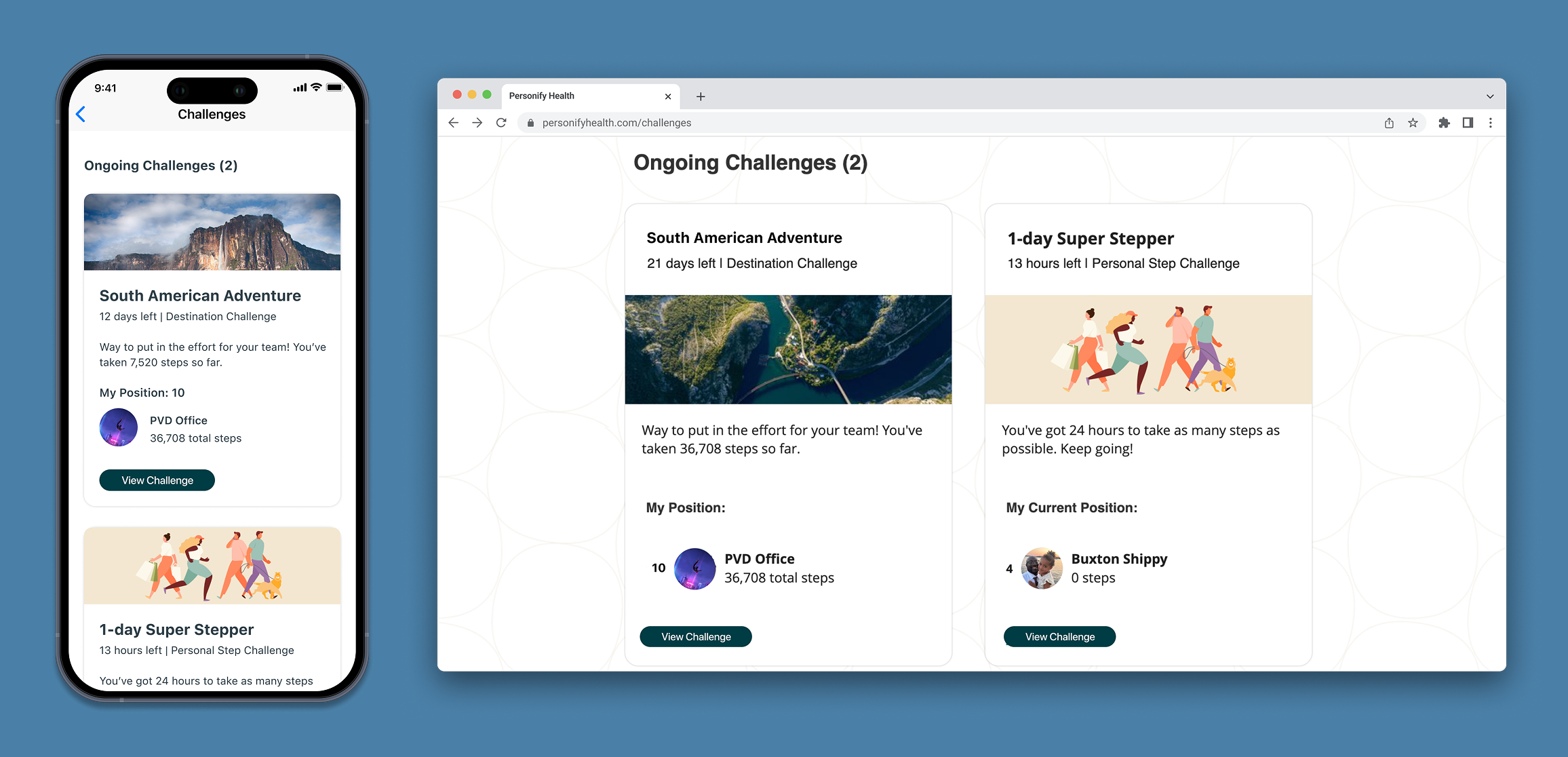
Designing a Responsive Challenge Experience
I approached the challenge experience with a responsive framework that ensured consistent interactions across devices. The design focused on simplifying navigation, improving progress visibility, and creating reusable UI patterns.
Ideation
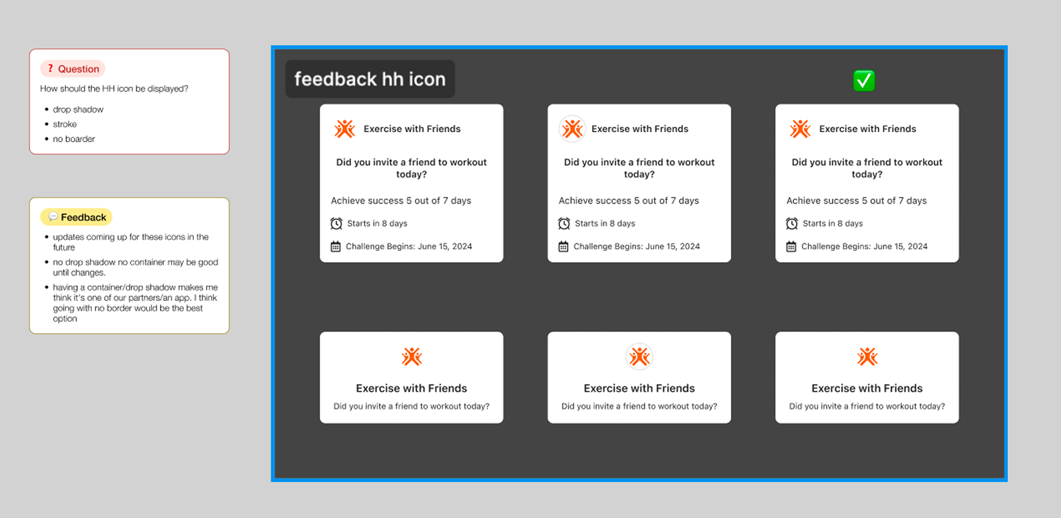
Iteration & Refinement
Throughout the process, I collaborated closely with product and engineering partners to refine the experience and address technical considerations.
Developer Handoff
Outcome
Fulfilled Client Commit and Post Launch
The redesign shipped in 2024 and the client successfully launched on it. What began as a responsive web commitment became a foundational redesign of the entire personal challenges experience. The updated framework unified two challenge types, two user roles, and five lifecycle states under a single coherent system across web and mobile. Post-launch, the product team expanded the challenges metrics framework to track new behaviors including daily creation rates, average days met, and unique creators, signals that the redesign had driven enough new engagement activity that the existing measurement model no longer captured it.
Up next
There's more to see
Some projects are available upon request due to NDA. Reach out and I'll share access.